Itaú App Home Redesign
Founded in 1924, Itaú Unibanco is one of the largest Brazilian banks. With approximately 12 million customers, it has many branches across the country and the world. In the last few years, Itaú has focused on digital channels, and today it has the app as the main channel for customer relationship.
Project
Home redesign of the Itaú main app, from discovery until prototype and live results analysis.
Role
Strategy Designer
UX Designer
Research Designer

2018 version
Research
The first step for our project was to understand the current scenario based on data, customer opinion and business objective.
I started collecting navigation and App store/Play store data to understand the current behavior of customers, and then I did some internal interviews to get more information and identify opportunities. After, I did some benchmark to take a deep look at other companies. And finally, I talked to some customers and non-customers to understand the perception and what they believed could be an ideal home page.
Key insights:
We were not dealing with a specific customer issue regarding the home page, but exploring market and improvement opportunities;
Our "home page redesign" would be more than just a facelift, considering the relevance of the home page, we had an opportunity to reposition the app in the lives of customers with a greater relevance, and in addition, to improve some app visual patterns.
Main opportunities:
Lack of communication about transactions
Lack of communication about updates and news in the app
Many complaints about the frequency of app updates
Static structure
Poorly accessed features
Low usage during the month
2. Insight
We had the Insight phase in three parts:
The focus group workshop with clients to explore behavior, their market references, and finally to co-create an ideal home page for a financial app.
The internal co-creation workshop which we invited some POs and designers to co-create a home page considering all the information raised before.
And finally, after gathering all the insights, we refined the insights and structured our proposal.
This phase was very important because we defined the entire strategic positioning of the project.
Key points:
App role: financial assistant, "made for me", changing "bad bank" image, and active communication about what really matters to the client.
Home page role: 360 view, informative and guiding, magazine cover.
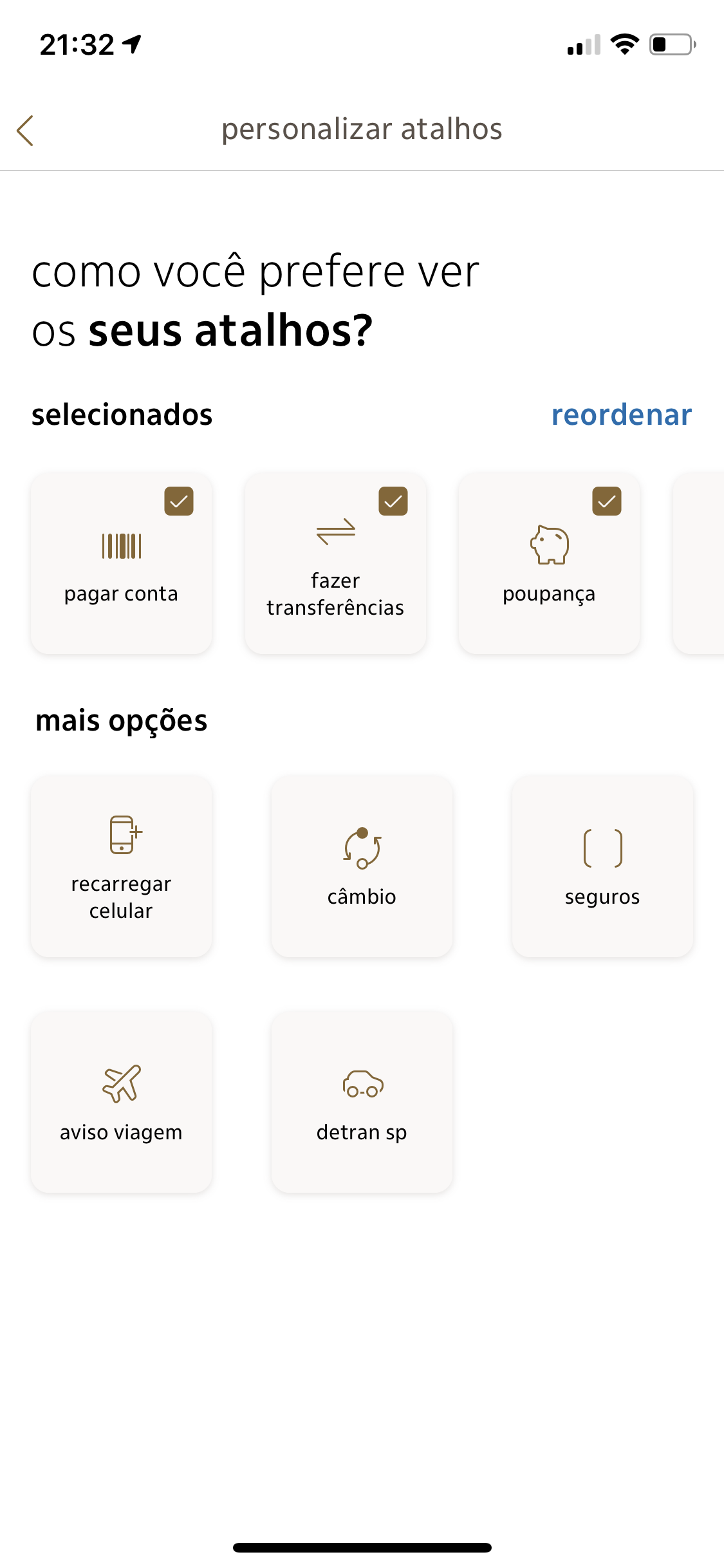
Proposed changes: new visual, customization, shortcuts, favorite contacts, contextualized sales offer, new tab bar organization, profile picture, redesign account types visual, more relevance for the calendar, predictability of balance changes, logout button, contextualized customer service.

3. Ideation
Considering we had already defined the whole strategic part of the project, I started to do some heuristic analysis about our app and other apps that stood out in order to define the best organization for our context.
So, for the Ideation phase, I joined all the informations that we collected before and designed our wireframe. This document was essencial to discuss ideas with other teams that we will need them to collaborate in the future.

4. Prototype
By strategy and better consistency, the UI designer of the project and I, chose to design what we believe to be the ideal complete version of the experience, to then divide it for development delivery. Some features was basically designed in order to collect live data, and then, based on it, make decisions and improvements.
All the designed prototypes was tested in usability tests with customers and employees.
Final visual definitions
Social media essence to encourage greater use of the app
Brand primary color to bring focus to specific elements
More motions
Personalization
More relevant and better organized information
Personalized and better looking banners
Font size work to highlight important informations
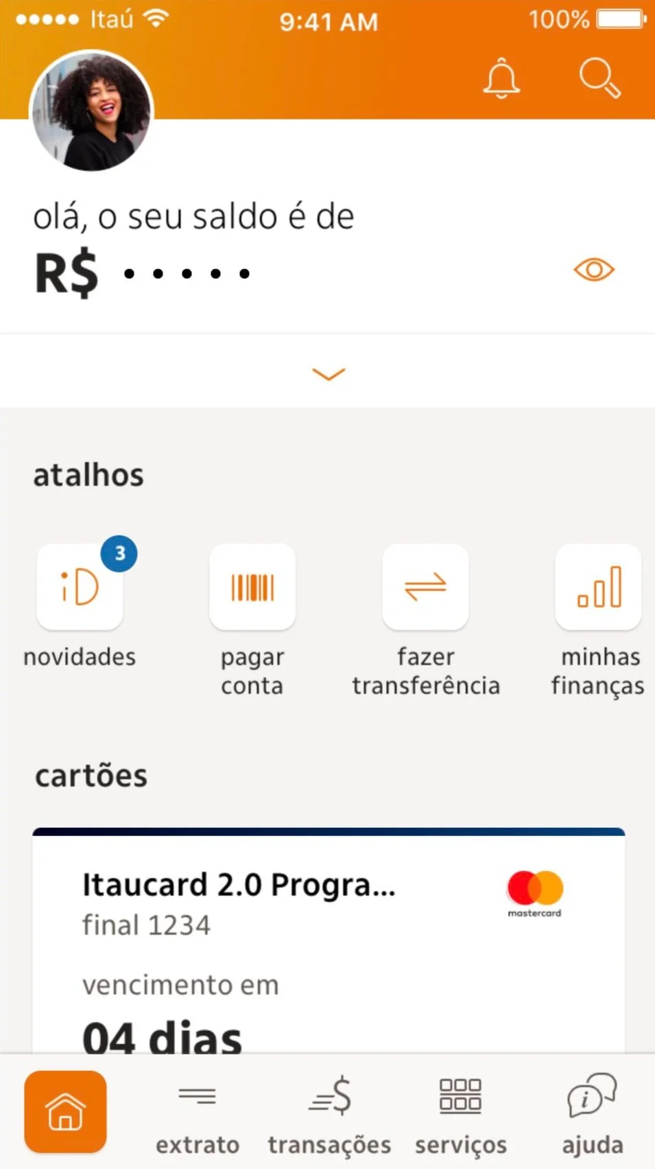
"Novidades" Feature
"Novidades", or "What's new”, is a space inspired by Instagram in order to get clients attention in a fun way and give more transparency about what happens in the app. This space brings the active communication with videos about new features and seasonal campaigns.
Taking our first redesigned home page version in an usability test, one of the most interesting insights was that, at first, we used a button with Itaú's logo for “What's New" and there was a considerable number of people who thought it would be about financial subjects such as fees or not interesting product offers. Few people showed curiosity to click and see what was in there. For the second phase of the usability test, we took all those previous feedbacks and adjusted the prototype from the logo to a happy face icon. This time, we had a very positive result in general, especially for the “What's New” feature where the previous negative perception no longer occurred. Many people showed interest and had a positive perception about the content inside the feature. They found it very interesting considering that recent financial apps currently doesn't have this type of communication.
MVP 1
Our first "slice" that went live were shortcuts, being the first customizable feature in the app. As it was the very first feature living together with the current app structure, the visual was in the same pattern as before. It was a small change but a big step :)
Results
30% increase in Payment and Transfer accesses in the first month;
Higher number of customers who started using only the shortcut to access both features.