PIX Payments
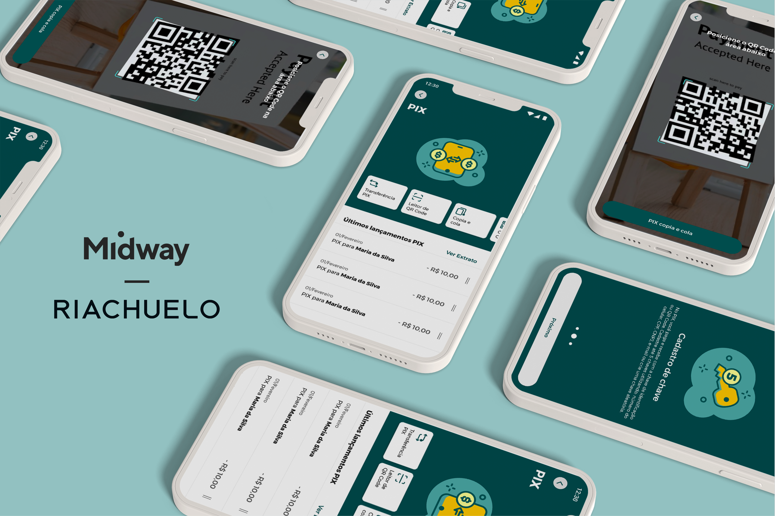
Riachuelo is one of the largest Brazilian fashion retail companies. Since 2008, Midway has taken care of financial products linked to Riachuelo brand, with more than 31 million customers in its portfolio. In 2018, Midway began the process of becoming a digital bank in Brazil with release in early 2021.
Project
Implementing Pix Payments in the Midway App according to the Central Bank of Brazil requirements.
Role
Concept the proposal solution of digital experience
Design strategy and activities planning
Define the base design interaction architecture
Prototyping (low and high fidelity)
Research
What is PIX
“Pix is the instant payment method of Brazil. The payment method created by the Central Bank (BC) in which funds are transferred between accounts in a few seconds, at any time or day.” (Central Bank of Brazil)
This new method of payment allows people to use QR Code for instant payments and some personal information as a transfer key. The population doesn’t need to memorize or write down long codes, and it is cheaper for everyone (including banks) than the current method. Pix is one of the biggest changes in payment methods in Brazil in the last few years.
Contex of the Project
Unlike other projects, Pix is a legal demand where the company must offer the service within the standards specified by the Central Bank of Brazil. Considering that it is a completely new feature and brand, the Pix regulations have undergone many updates. Our team was responsible to follow these regulations updates to get the approval from the Central Bank and improve the experience of the functionality from this point, so it was a big challenge for everyone.
It is important to mention that the following 5 steps were cyclical, so for each MVP we had to visit all these stages again.
1. Explore
I started on the project with few people on the team, and at the beginning, we had to understand all the information, organize it and make a plan. For the first time in my career, we didn’t have other companies with the functionality to benchmark because the Pix would be released by the Central Bank of Brazil and by the biggest financial institutions at the same time. Therefore, I started to understand the new functionality in general, which are the mandatory items to be evaluated in order to have the approval from the Central Bank, people's initial perceptions and benchmark for similar features.
2. Insight
Considering it is a legal demand, our Insight phase was shorter, as we understood that we would have to start with the basic mandatory items to get approval from the Central Bank of Brazil and then start to actually develop Pix in the company with a market differential.
So I did a planning of all the UX/UI/IA design activities for the project's MVP and registered our long term goal and all the past results to keep the whole team in the same direction
3. Ideation
For each MVP, I read the Central Bank Mandatory Itens document in detail for each feature. I looked at the benchmarks of similar functionalities as well , and made a wireframe, which went through validation by all stakeholders before moving on to the prototyping phase.
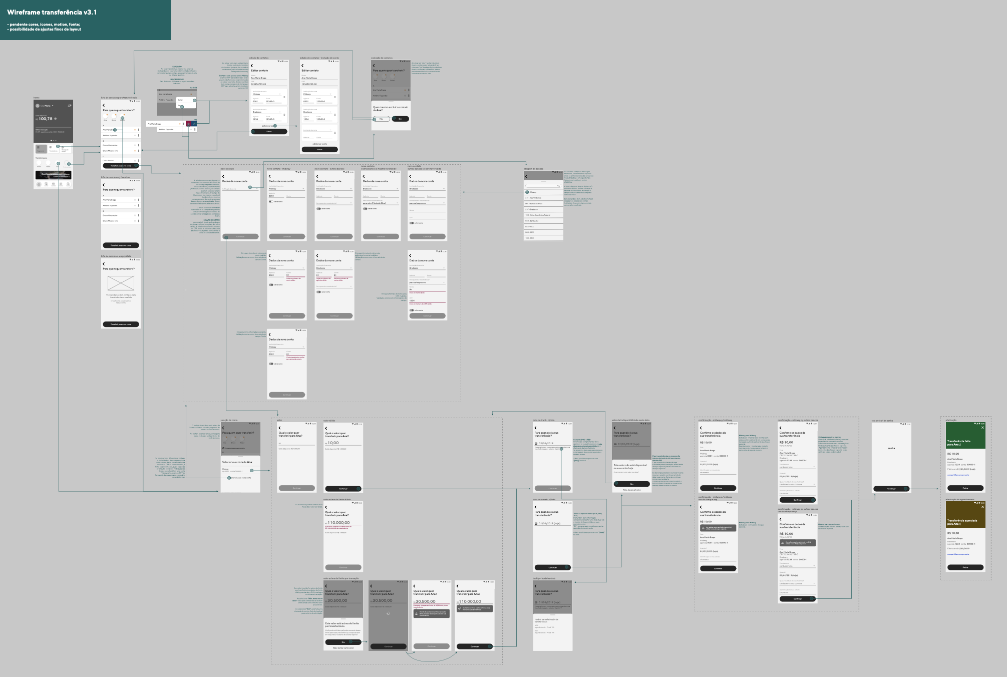
4. Prototyping
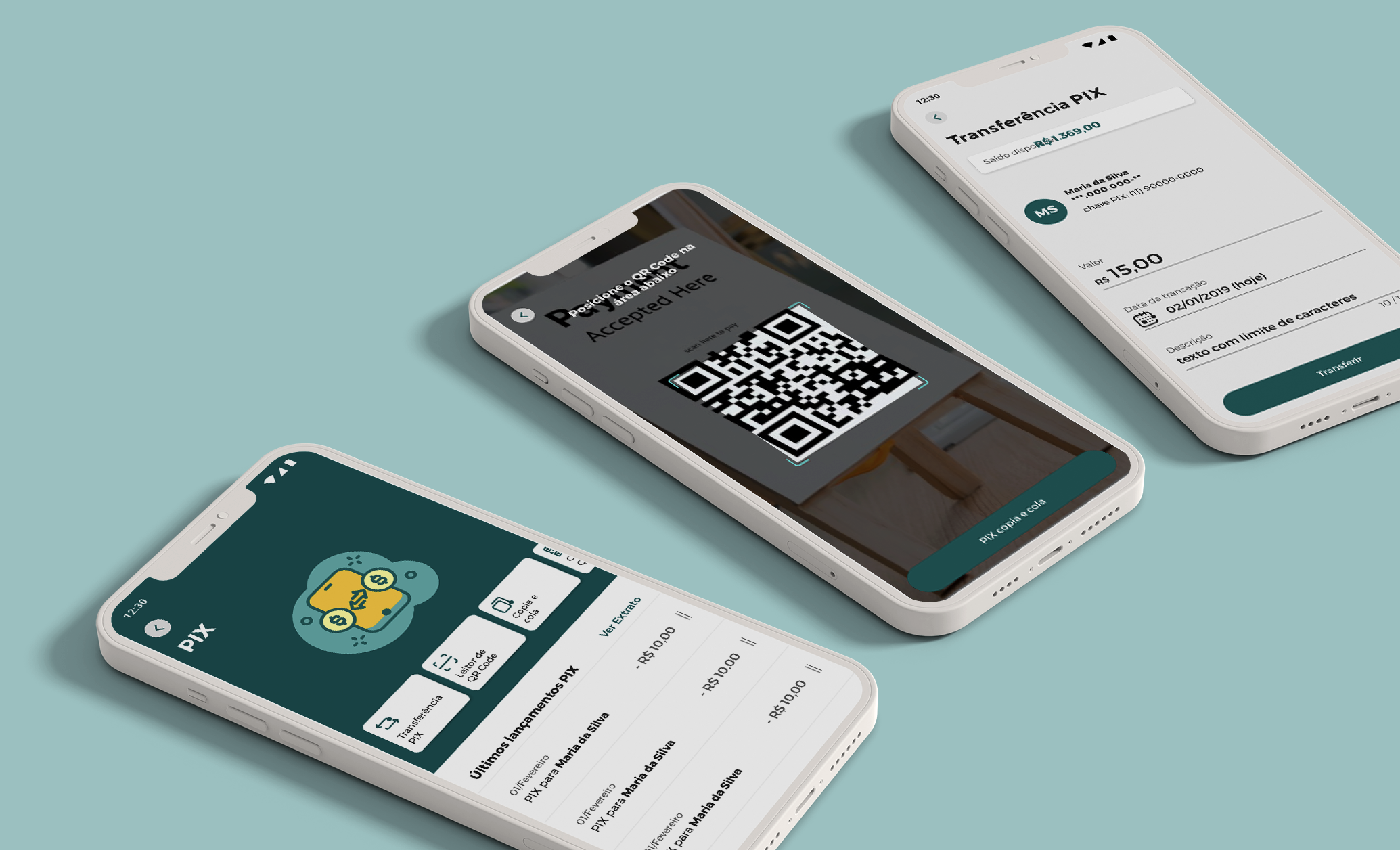
For the UI, I always work on the following items consistently and strategically: branding, colours, illustrations/photos/icons, information architecture, language and interaction. To find their balance within the context of the project, it is the key point for a good UI. So usually I have a previous work to understand the branding, the channel design pattern and the language used, and then start working with the high fidelity prototype. The idea is the experience to be not only functional but also visually delightful without harming the brand or the consistency of the channel.
Therefore, for Pix, considering it is a new feature in the national financial market view, some elements were very important for the creation of the final prototype:
Illustration: used in strategic screens to bring lightness and fun, to celebrate completion of actions and to facilitate the understanding of some contents;
Icons: Icons were used for a faster reading and understanding of some contents, and it brings more lightness and visual appeal to the experience.
Language: all information was written in a visual structure that was easier to read and to understand, and without many technical terms from banks;
Branding: the chosen colours consistent with the brand and the design pattern of the app. The weight of the colours were also worked to bring the focus of the customer's vision, always taking care with the accessibility in contrast.
Elements: elements used are familiar in other apps, without the need for complex gestures for interaction, which contributes to the ease of using a new functionality.
And, to ensure that the choices were close to the ideal, all prototypes were tested in usability tests and were adjusted according to customer feedback.
RESEARCH
We had two types of user research: exploration interviews and usability test.
A) For the exploration interviews, we talked to some clients to understand their current perception about Pix, mainly if it might be useful for them comparing to their bank use. The result was essencial to create the writing and nomenclatures strategy.
B) And for the usability test, I applied the test giving some activities for the interviewees to perform in the app prototype, in a way very close to a real situation.
Key insights
As shown above, Pix was a new method of payment, so almost all the interviewees did not know exactly what was the difference from the current method of payment and what are the advantages of it. It would be necessary a great communication through our digital channels and a well planned customer service.
The functionalities we used in the usability test were close to the market patter, so almost every client showed ease of use. Despite the uncertainty of what is Pix, the familiarity in usability helped a lot.
Conclusion
Pix was a very interesting project which I was able to participate from its conceptualisation until the operational follow-up in production. I had a lot of autonomy and freedom to create and define strategies. The most difficult points were the Central Bank updates, which we had to monitor the changes announced at national level and apply them to our project. But I was lucky to have a very collaborative and efficient team to get the best possible result. I’m very proud about the final result! :)